
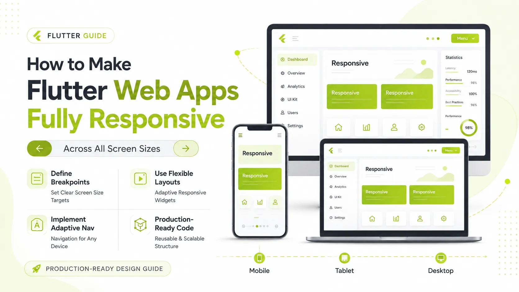
How to Make Flutter Web Apps Fully Responsive
Building for the web with Flutter is powerful, but making it truly responsive across mobile, tablet, and desktop is where most apps struggle. Apps usually fail because of layout breakdown on different screen sizes. In this guide, we will look at how to approach fully responsive design using scalable patterns.
Why Responsiveness Matters
Unlike mobile apps, Flutter Web runs on small mobile devices, tablets, laptops, and large desktop screens. If your UI is not adaptive, components overflow, layouts break, and users drop off instantly. Instead of designing for one static viewport, you should design for breakpoints and flexible layouts.
Key Strategies for Responsive Design
- Define Clear Breakpoints — Divide screens into consistent categories for mobile, tablet, and desktop viewports.
- Centralize Logic — Avoid scattered media queries by using a central layout utility to evaluate system constraints.
- Use Flexible Components — Eliminate fixed widths and heights by using widgets that dynamically stretch or compress.
- Leverage Constraint Builders — Build adaptive UI states using components that read real-time layout constraints natively.
- Adapt Navigation — Use appropriate patterns like bottom bars for mobile, rails for tablets, and sidebars for desktop profiles.
- Scale Grid-Based Content — Implement cross-axis boundaries so columns adjust grid numbers dynamically.
- Scale Typography — Adjust font baselines relative to screen real estate to keep readability high.
Common Mistakes to Avoid
Many projects face issues because they overuse manual sizing, design strictly for a single form factor, or scale up mobile views aggressively on desktop environments without altering architecture layouts.
Final Thoughts
Responsive web development is a default system choice. Combining breakpoints, fluid widgets, and device-aware layouts results in enterprise-grade web applications that run beautifully on any hardware scale.